Where Pearls Not Only Come Before Swine... But From Them
Tuesday, May 23, 2006
If I'm Being Honest... (#1)
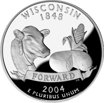
... I really hate Wisconsin's quarter. They can put whatever they want on the back of a quarter and they choose a cow and a wheel of cheese?
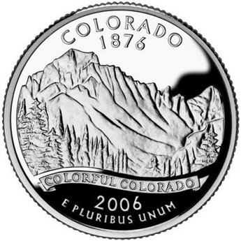
As for Colorado, well, I don't hate it as much as Wisconsin's. But seriously -- the most eloquent thing they could come up with to memorialize their state on the back of a quarter was "Colorful Colorado"? Kind of get the feeling they punted.
I was kind of partial to the sun and the waves design in the "Top 5 Finalists Submitted to the Mint". It was different, but not as cheesy as, well, Wisconsin.

4 comments:
our state (CA) quarter is OK, but one of the choices that lost I think would have been best.
it was simply rings as if the quarter was a slice of a giant sequoia (the HUGE redwoods)
I know it sounds weird, but it was a cool design.
Some of the choices were awful.
Like the Hollywood hills sharing the quarter with the golden gate bridge??
I was kind of partial to the sun and the waves design in the "Top 5 Finalists Submitted to the Mint". It was different, but not as cheesy as, well, Wisconsin.
http://images.google.com/imgres?imgurl=http://www.quarterdesigns.com/proposed/californ/muir.jpg&imgrefurl=http://www.quarterdesigns.com/proposed/californ.html&h=528&w=528&sz=43&tbnid=3sGoUqlfnqkJ:&tbnh=129&tbnw=129&prev=/images%3Fq%3Dcalifornia%2Bquarter%26hl%3Den%26lr%3D&start=2&sa=X&oi=images&ct=image&cd=2
I love what Texas used on the back of their quarter, Texas. Hubris at its best.
You're absolutely right. That is sort of lame.
Post a Comment